Real Estate Branding

Alena Kučerová

Client

Alena Kučerová

Services

Brand identity · Listing website · Social & print

Year

2026

Type

Concept

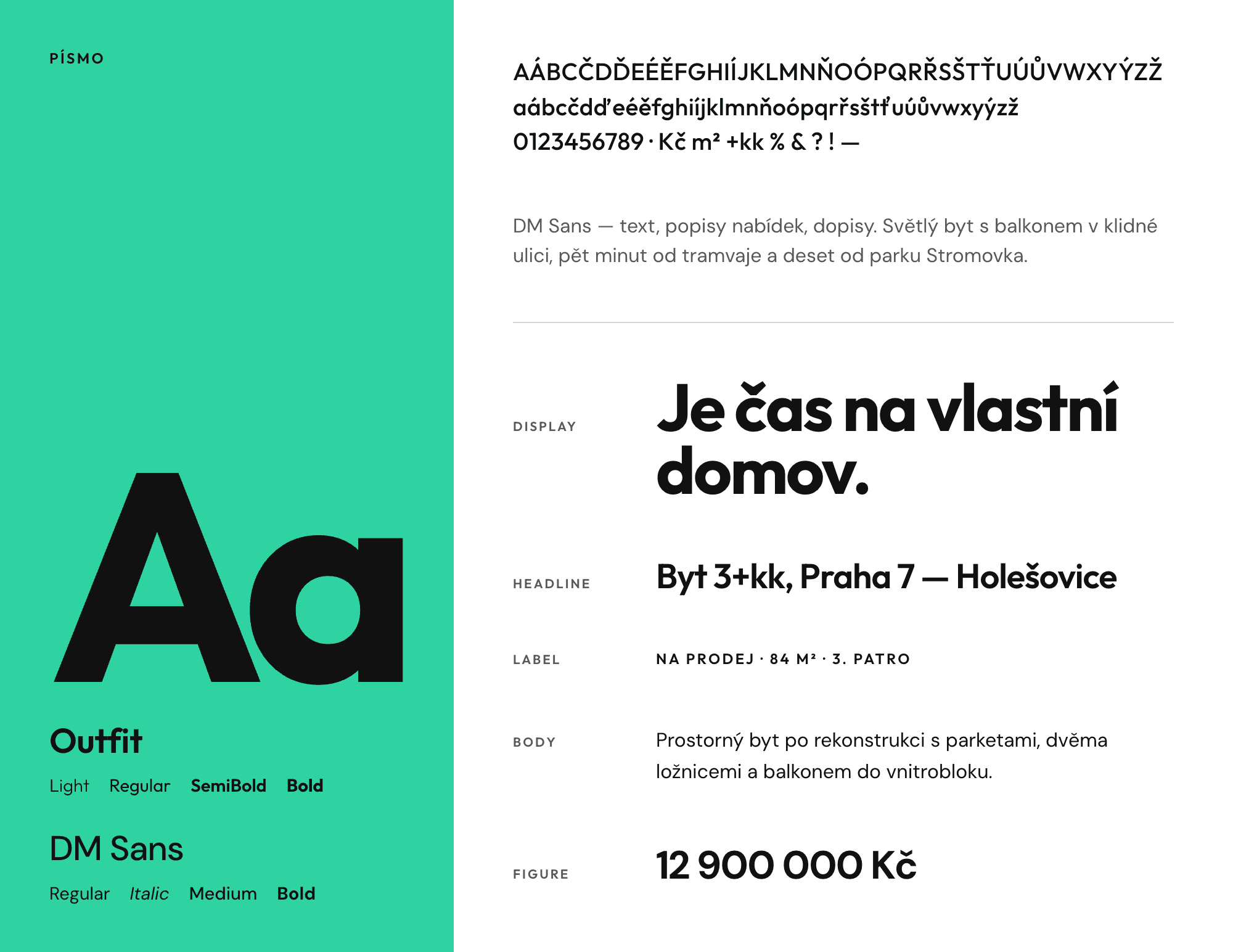
A monogram that works at two scales: small as a signature beside her name, and blown up until it fills a building banner. Green and black, one typeface, no decoration. Built for an agent covering the whole of Prague, sales and rentals alike, then applied to window cards, open house announcements, valuation ads and sold posts. Concept project.

The Goal:

The Goal:

Build an identity for an agent who works across the whole of Prague and across sales, rentals and purchases, rather than one district or one price band. Alena's clients are mostly people buying or renting their own place for the first time, or moving up to something bigger. The brand had to feel confident and easy to approach, and hold together whether it appears on a window card in Holešovice or a banner hung off scaffolding.

Build an identity for an agent who works across the whole of Prague and across sales, rentals and purchases, rather than one district or one price band. Alena's clients are mostly people buying or renting their own place for the first time, or moving up to something bigger. The brand had to feel confident and easy to approach, and hold together whether it appears on a window card in Holešovice or a banner hung off scaffolding.

The Challenge:

The Challenge:

An agent who covers everything risks looking like they specialise in nothing. Most estate agent branding solves that by going neutral, which is how the whole category ended up looking identical. The work was finding a mark strong enough to be recognised from across the street, and a system flexible enough to carry an 18 million koruna house in Černošice and a 26 500 koruna monthly rental in Praha 7 without either looking out of place.

An agent who covers everything risks looking like they specialise in nothing. Most estate agent branding solves that by going neutral, which is how the whole category ended up looking identical. The work was finding a mark strong enough to be recognised from across the street, and a system flexible enough to carry an 18 million koruna house in Černošice and a 26 500 koruna monthly rental in Praha 7 without either looking out of place.

The Result:

The Result:

A monogram that interlocks the A and the K into one geometric form, and works at two scales: small as a signature beside her name, and blown up as a full bleed graphic that crops photographs or fills a poster on its own. Green and black, one typeface, no decoration. From that come window cards for sale and rental, open house announcements, sold posts, valuation ads and large format outdoor. A new property means new photographs and new numbers. The mark does the recognising.

A monogram that interlocks the A and the K into one geometric form, and works at two scales: small as a signature beside her name, and blown up as a full bleed graphic that crops photographs or fills a poster on its own. Green and black, one typeface, no decoration. From that come window cards for sale and rental, open house announcements, sold posts, valuation ads and large format outdoor. A new property means new photographs and new numbers. The mark does the recognising.

MORE WORKS

Explore similar projects