Team Ascend
Competitive esports, built for the professional level.
Team Ascend
Competitive esports, built for the professional level.
Built for the big screen, not the bedroom stream.
Team Ascend had the results and the roster, but their brand was holding them back from the sponsorship deals their performance warranted. Competing at a professional level while looking like an amateur outfit creates a gap that no amount of tournament wins closes on its own. The brand needed to match the ambition.
We researched the visual language across the top tier of competitive esports, studying how the organisations attracting the biggest sponsorship deals and broadcast deals presented themselves. Two things stood out. The brands that commanded serious commercial attention had crossed over from gaming aesthetics into sports brand territory: bold, legible, scalable. And the brands that were failing commercially were the ones still relying on neon gradients and aggressive iconography that looked impressive on a Discord server and fell apart on a billboard or a sponsor deck.
Team Ascend was already operating at a level that deserved the former. The strategic decision was to build a brand that could live in both worlds, credible enough for a boardroom conversation with a sponsor, and energetic enough to own a mainstage moment.
Credible enough for sponsors. Loud enough for the mainstage.
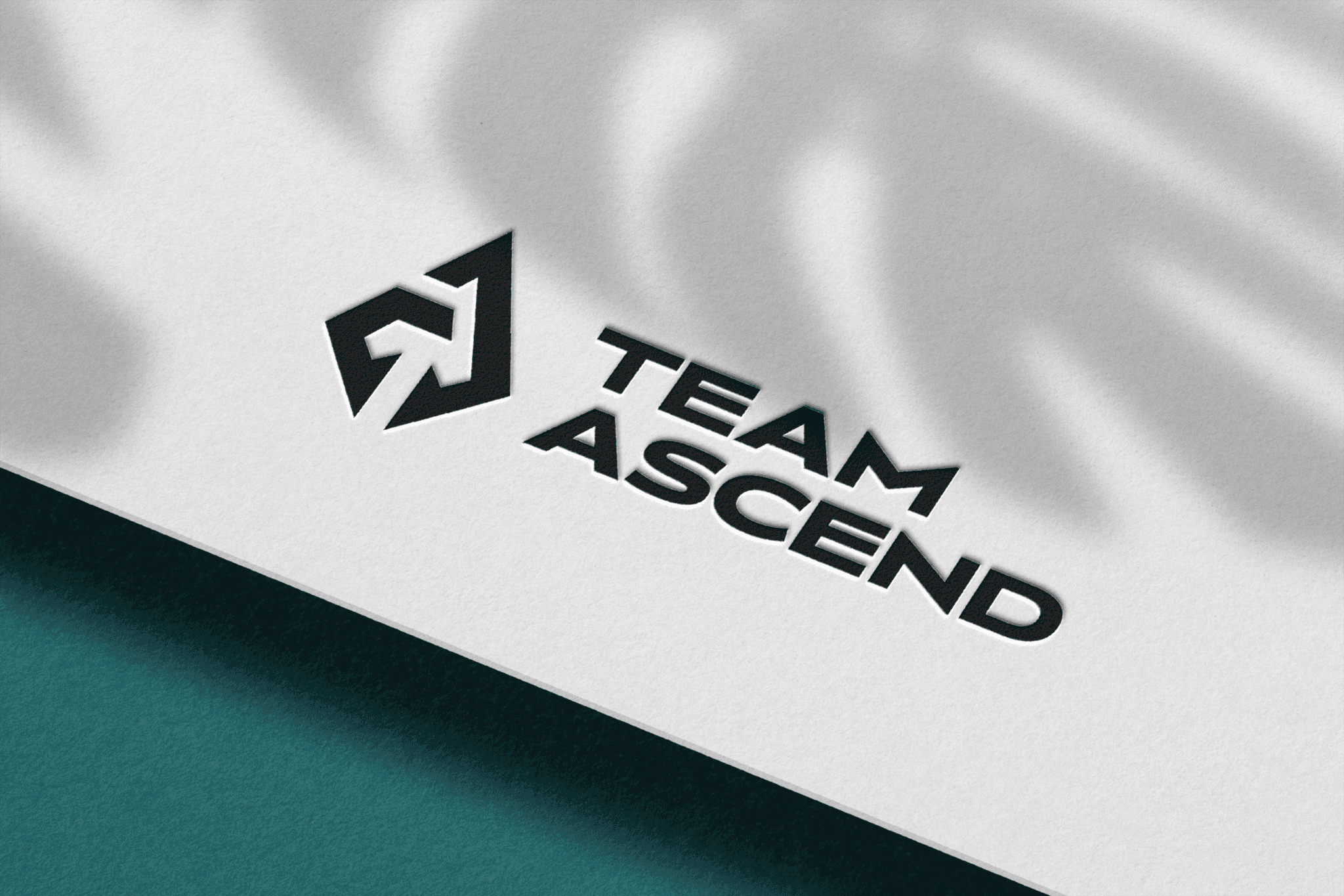
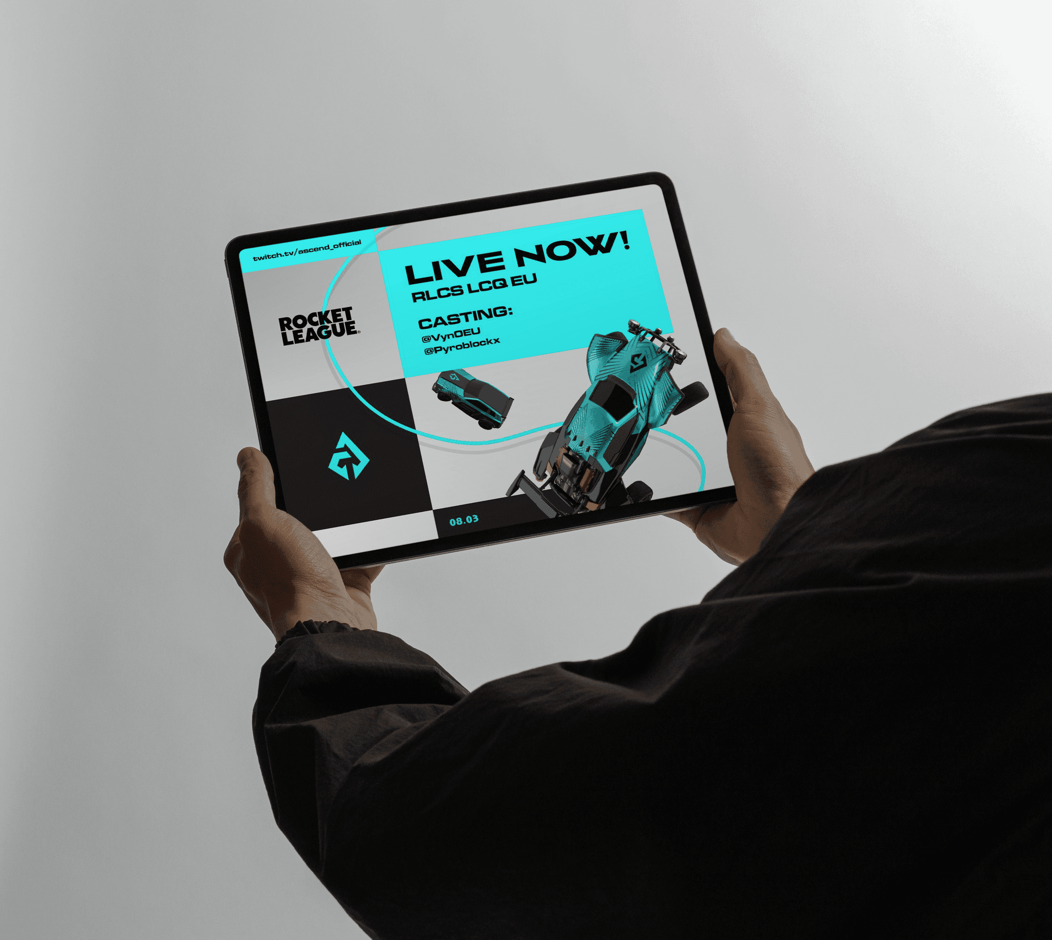
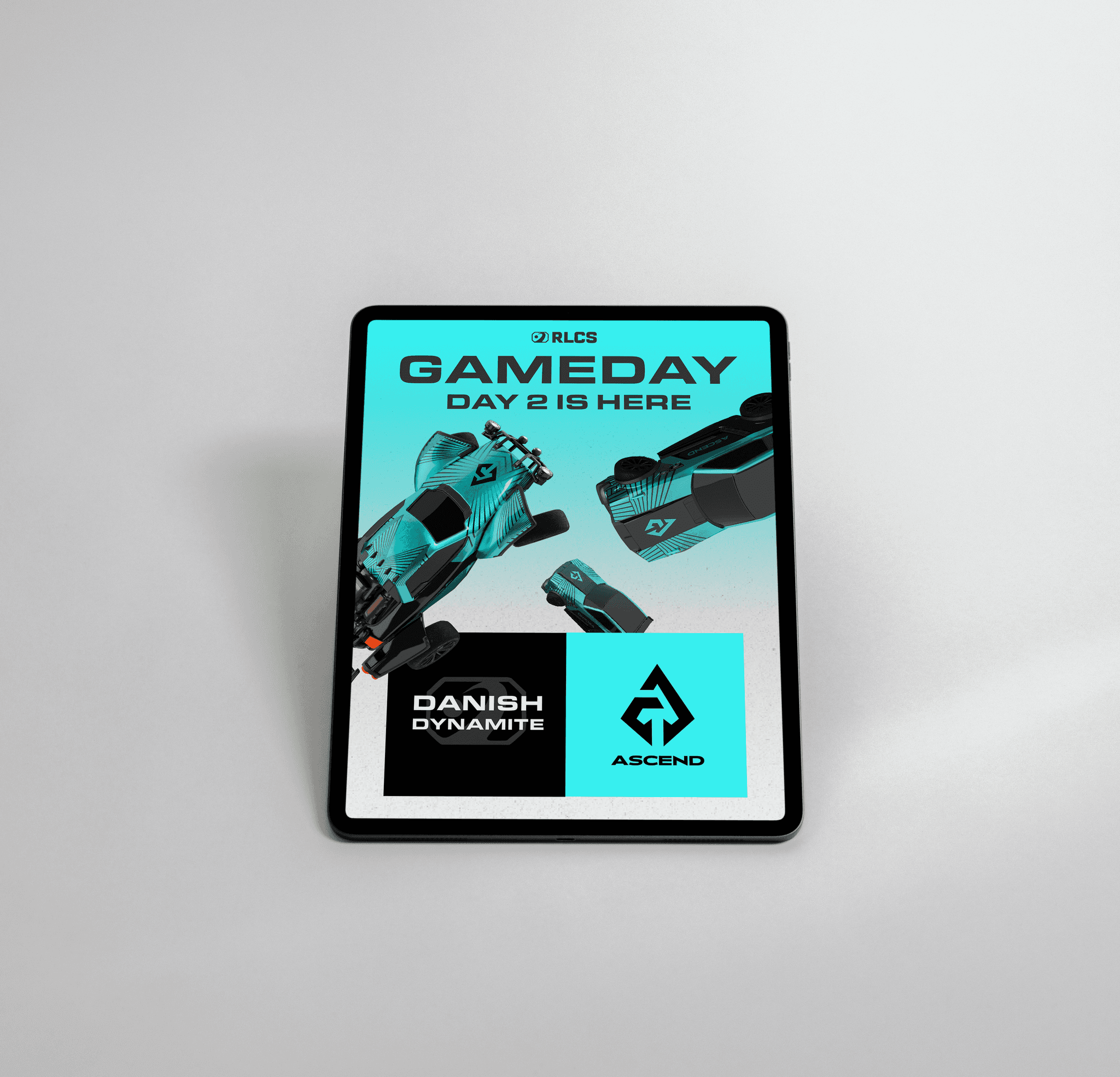
The identity is built on black and electric teal, a pairing that carries competitive energy without collapsing into visual noise. The angular logo mark is sharp and directional, referencing upward momentum without resorting to cliché. The all caps typographic system gives every application, from billboard to tablet UI to gameday graphics, the weight of a broadcast brand. Applied across digital screens, social content, and presentation decks, the system works at every scale. A brand that looks like it belongs in the league it is already competing in.
Year
2025
Industry
Brand Identity
Scope
Visual Strategy, Logotype, and Motion Guidelines
Timeline
6 weeks
Year
2025
Industry
Brand Identity
Scope
Visual Strategy, Logotype, and Motion Guidelines
Timeline
6 weeks
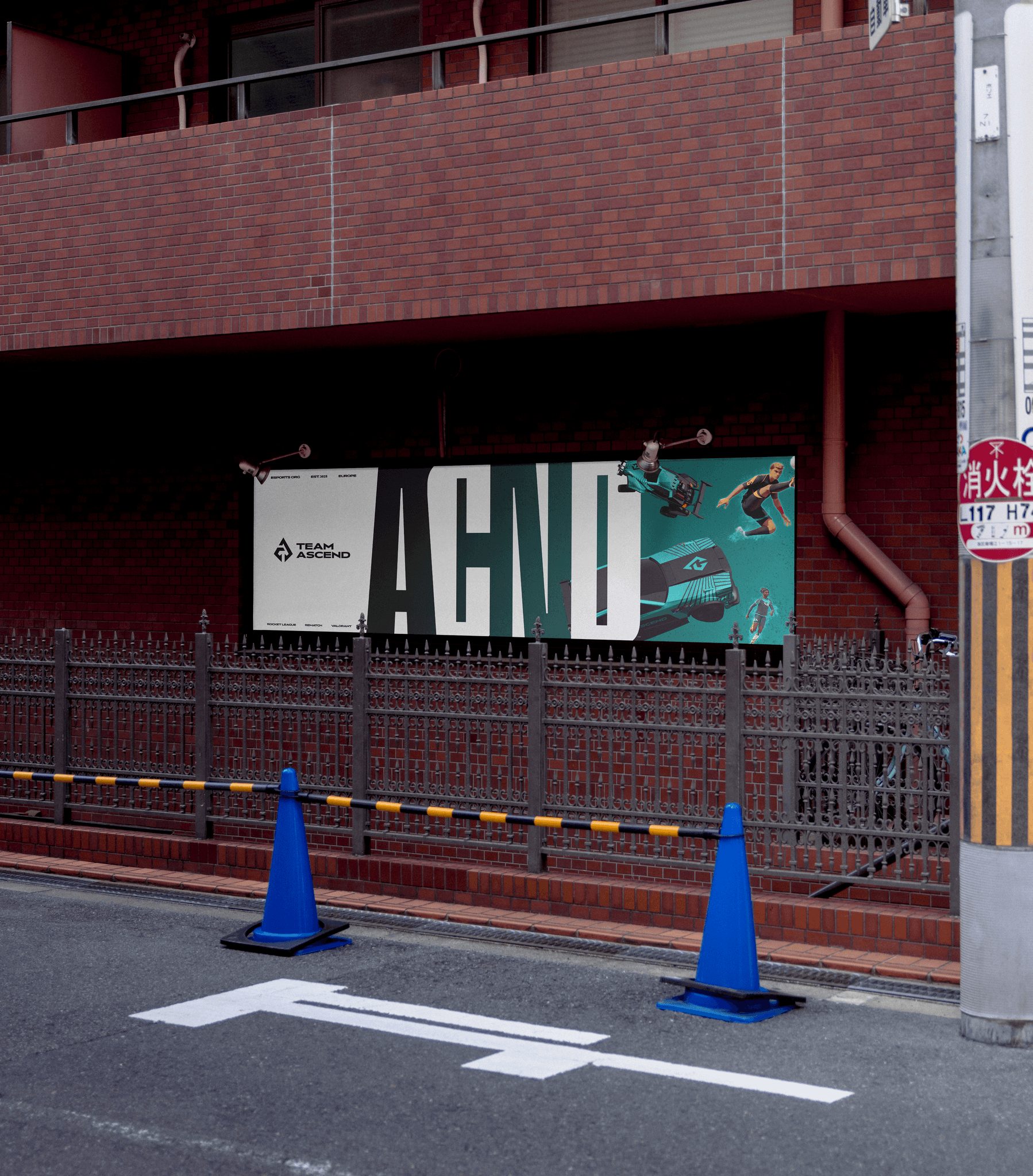


Built for the big screen, not the bedroom stream.
Credible enough for sponsors. Loud enough for the mainstage.
Team Ascend had the results and the roster, but their brand was holding them back from the sponsorship deals their performance warranted. Competing at a professional level while looking like an amateur outfit creates a gap that no amount of tournament wins closes on its own. The brand needed to match the ambition.
We researched the visual language across the top tier of competitive esports, studying how the organisations attracting the biggest sponsorship deals and broadcast deals presented themselves. Two things stood out. The brands that commanded serious commercial attention had crossed over from gaming aesthetics into sports brand territory: bold, legible, scalable. And the brands that were failing commercially were the ones still relying on neon gradients and aggressive iconography that looked impressive on a Discord server and fell apart on a billboard or a sponsor deck.
Team Ascend was already operating at a level that deserved the former. The strategic decision was to build a brand that could live in both worlds, credible enough for a boardroom conversation with a sponsor, and energetic enough to own a mainstage moment.
The identity is built on black and electric teal, a pairing that carries competitive energy without collapsing into visual noise. The angular logo mark is sharp and directional, referencing upward momentum without resorting to cliché. The all caps typographic system gives every application, from billboard to tablet UI to gameday graphics, the weight of a broadcast brand. Applied across digital screens, social content, and presentation decks, the system works at every scale. A brand that looks like it belongs in the league it is already competing in.
Scope
Visual Strategy, Logotype, and Motion Guidelines
Timeline
6 weeks
Industry
Brand Identity
Year
2025